

In the book Graphs Maps Trees by Franco Moretti, his central arguments were quantitative history, maps from geography, and trees from evolutionary theory. He explains this by using
Graph to explain the political and social changes. For example, He graph the number of new novels published each year, in Japan, Denmark, France and Italy. By presenting this information in a quantitative and graph form it will help people to easily interpret the data.
I find Moretti’s argument to be compelling because he uses logic and science to justify his arguments, which is new, compared to other critical theorists whose arguments are mostly based off opinions.
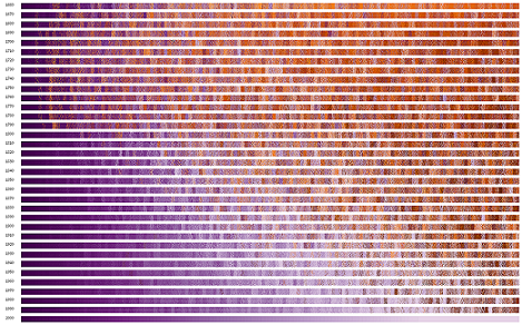
Moretti argue about the history of novels, is that it reflects individuals structure and changes by contributing to society and politics. The argument requires a graph because it is useful when presenting a lot of data especially, when it pertains to plots and genres.
The graph that appealed the most to me was Figure 9 entitled “British novelistic genres, 1740-1900” because its focuses on our limits of the imaginable, meaning it pushes our boundary on the types of novel British people are reading.
After visiting the site www.inforrmationisbeautiful.net, I found two particular visuals to be very captivating which are, “Left Vs. Right” and “ Because every country is best at something.” In “Left vs. Right”, they are trying to accomplish giving us an insight of who to vote for by telling us what both democrat and republicans stand for.
The data it’s seem to be using is data based off of government and what each politics stands for. This argument is effective because it’s very detailed on what each government believes. This argument can be made in an academic article because it’s well detailed and it gives us an idea on the type of arguments to use.
In “Every Country best at Something,” it is trying to accomplish giving people an use on what each country is good at. For example, Sweden is number one when it comes to pop music. This article could not be used in academic form because the number one thing that the country is good at could be anything. It doesn’t have a central theme.
Sadad Mohammad
Hey Prittania,
How interesting was the “Every Country best at Something,” I laughed so hard when we read that were good at spam email. Also even though I didnt agree with some of the things the Author said, they did a great job to back up their argument. Your absolutely right about the compelling argument how can you deny facts and data right?
Prittania Shaw
I wouldn’t have said these date are false because I’m not sure where they got there sources from. What I would have likes if they had stick to certain topics rather than, being so broad. Yes compelling arguments need both facts and data in order to make their cases.
Mpenzi Campbell
I enjoyed your article. We shared very similar views. Although, I found the reading very boring a quite hard to follow at times.
Andie Silva (she/her)
That’s funny you should say that, Mpenzi, because in your blog you suggest that reading was meant for “the average person.” This is one important reading why we have to be thorough and detailed when writing arguments for the web–so that there is as little space for misunderstanding as possible.
Andie Silva (she/her)
Are graphs really easy to interpret? Are they easier than plain text? I’d like us (as a class) to think further about that idea of representing “a lot of data,” and I’m glad you brought it up! I will be watching out, however, for your arguments to grow more detailed and reflective in the future. Expand on ideas like what you mean by “detailed” and share your questions, opinions, ideas beyond answering the question at hand.
Samirath Gnabode
hey Prittania, It’s true that Morreti’s argument is compelling but I believe he made outstanding points explaining how quantitative approach can be used to improve our reading process.I like how you’ve analyzed both graphs from informationisbeautiful. However, you should expand more your arguments , how do you find Morreti’s approach , Do you think there’s better ways to improve close readings other than using graphs, maps?